Sherwood Forest Faire
Poster Design | Event Branding | Hand Lettering
Sherwood Forrest Faire is an annual, 8 week long event held at a locally owned medieval-style village, with over 100 permanent buildings on 25 acres, including stages, pubs, merchant shoppes, wedding venues, a complete castle, and more.
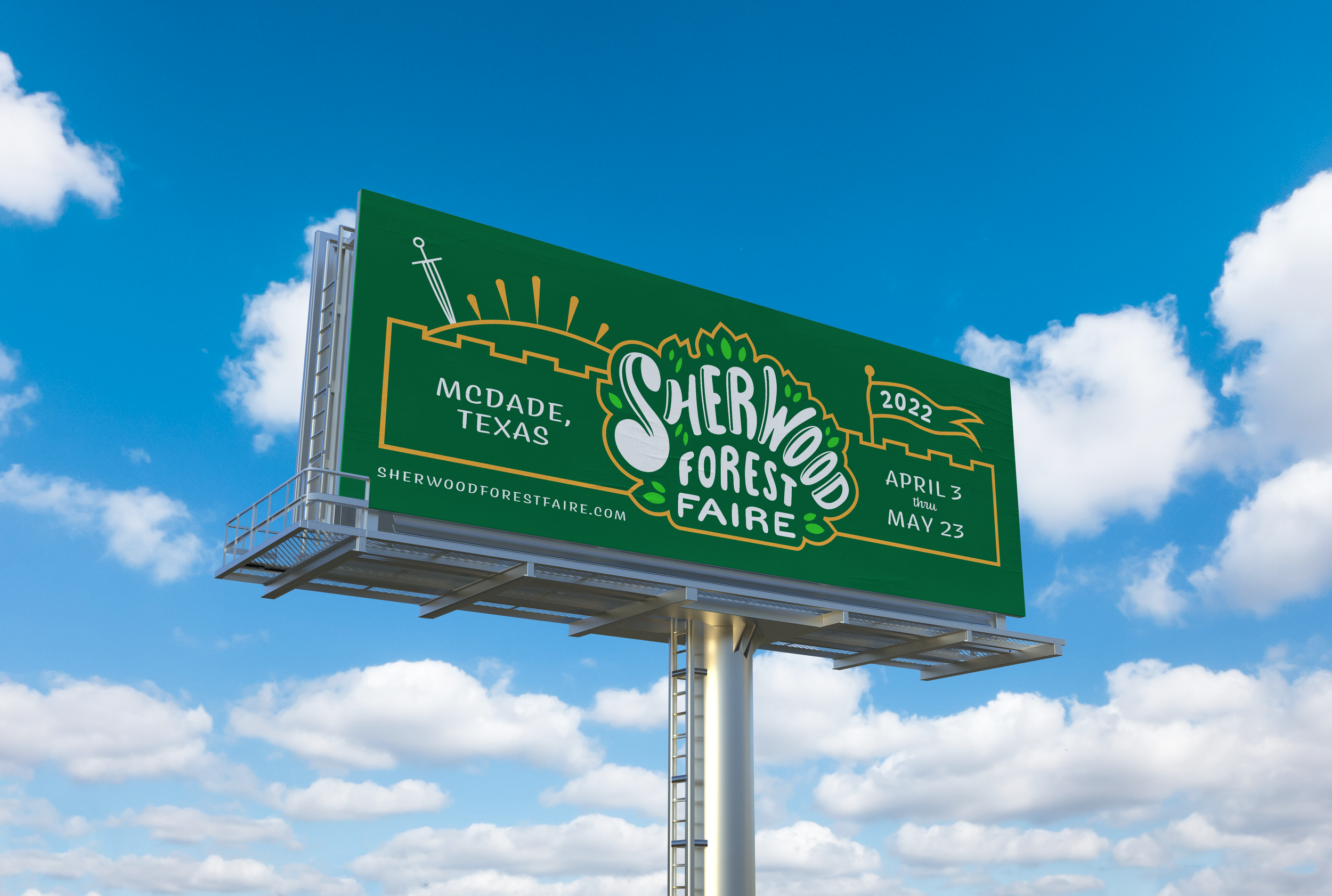
Challenge: To design branding and marketing materials for the 2022 Sherwood Forest Faire season, featuring hand lettered type and poster design as central components.
Inspiration & Ideation
Moodboard
The project began with collecting a variety of typography focused design examples. I organized my findings into a few loose categories, which I think of as “storybook medieval”, “highly decorative hand lettering”, and “organic texture overlays”. Ultimately, I was inspired in some way by all three.
Sketches
Additional Sketches
From my initial round of sketches, I chose three poster directions to explore further, and began experimenting with different styles of hand lettering.
Option 1
Option 2
Option 3
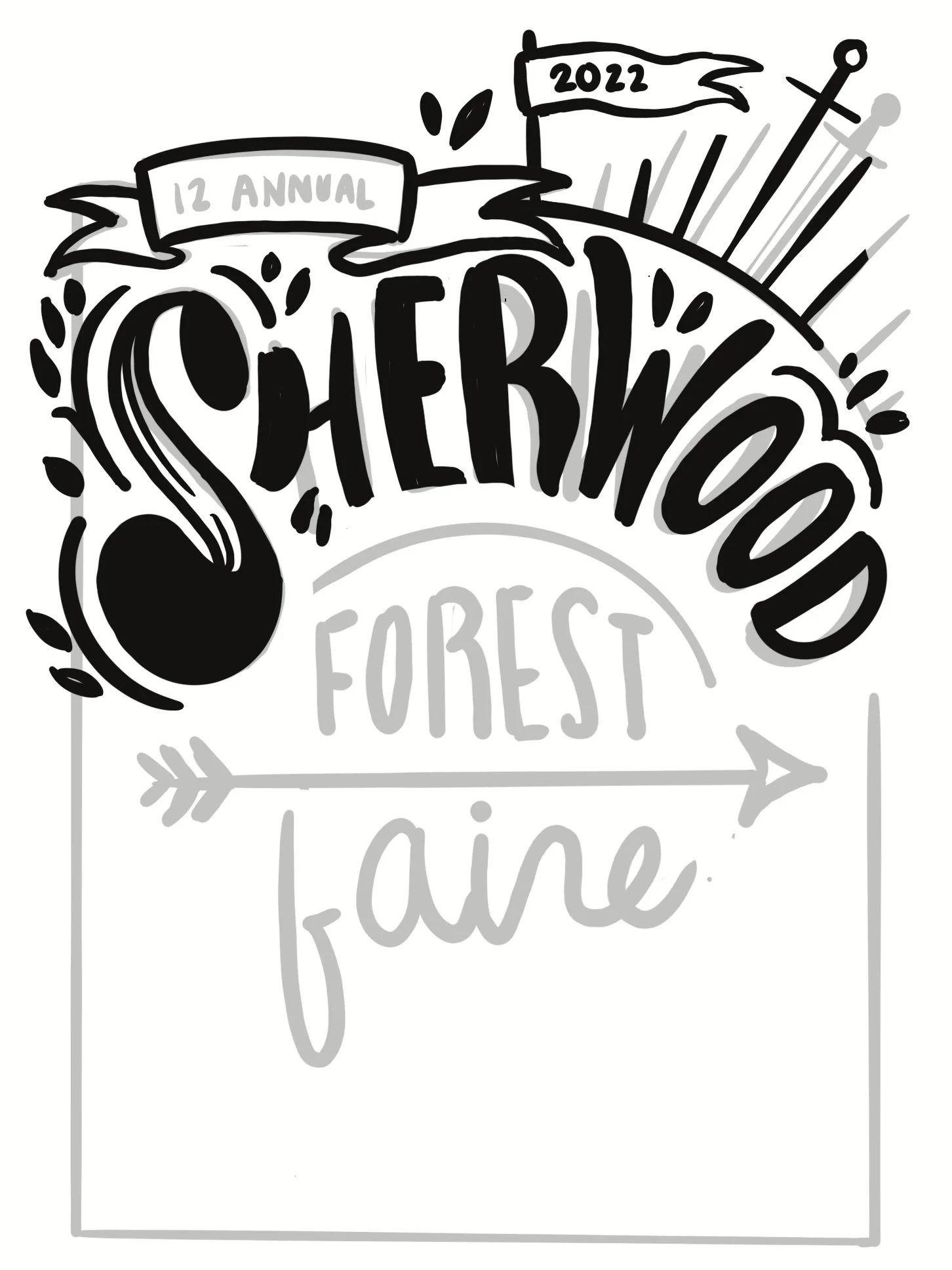
Final Sketch
After receiving feedback, I moved forward with the second option which best emphasized the title and included illustrated embellishments inspired by the medieval theme of the event. Additional detail and color were incorporated in this final sketch. The next step was to refine the sketch in Illustrator, finalize the color choices, and add type for the secondary information.
Final Design
Reflection
I am happy with how the project turned out. The poster in particular feels fun, engaging, and perfect for a medieval-inspired, family-friendly event. I think the branding has potential beyond this school project, and I would love to be able to bring some version of this to life for Sherwood Forest Faire in the future. I also enjoyed experimenting with hand lettering and plan to develop this skill more moving forward.


